You can make a chart in PowerPoint or Excel. If you have lots of data to chart, create your chart in Excel, and then copy it into your presentation. This is also the best way if your data changes regularly and you want your chart to always reflect the latest numbers. In that case, when you copy and paste the chart, keep it linked to the original Excel file.
Try it!
To create a simple chart from scratch in PowerPoint, click Insert > Chart and pick the chart you want.

-
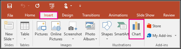
Click Insert > Chart.
-
Click the chart type and then double-click the chart you want.
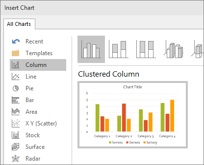
Tip: For help deciding which chart is best for your data, see Available chart types.
-
In the worksheet that appears, replace the placeholder data with your own information.

-
When you insert a chart, small buttons appear next to its upper-right corner. Use the Chart Elements
 button to show, hide, or format things like axis titles or data labels. Or use the Chart Styles
 button to quickly change the color or style of the chart.
Tip: The Chart Filters
 button is a more advanced option that shows or hides data in your chart.
 -
When you’ve finished, close the worksheet.