Create designs
that inspire
that inspire
Productivity
Social media
Print


How it works

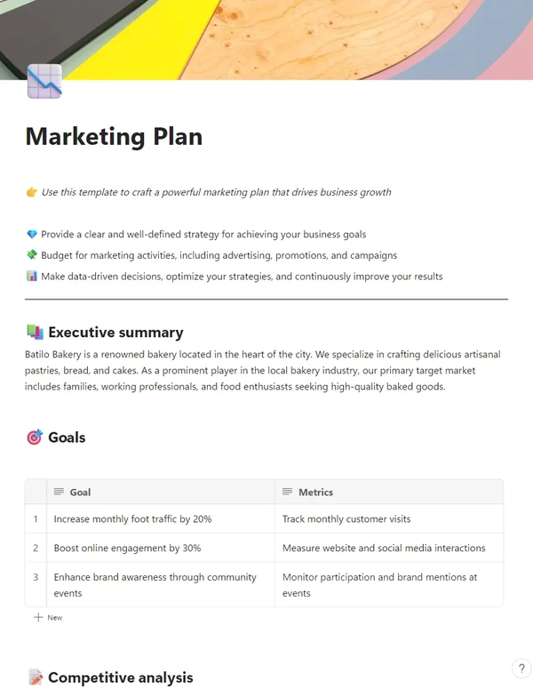
1. Start with the perfect template
Search for anything—style, topic, image, or color—or look around the catalog for inspiration. You'll find professionally designed templates for whatever you need to create.
