
Welcome to Microsoft Support
Please sign in so we may serve you better Sign in
Hello, , welcome to Microsoft Support
Trending topics
Microsoft account & storage

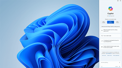
Meet Microsoft Copilot
Achieve anything you can imagine with your AI companion in the apps you already use every day.
Explore
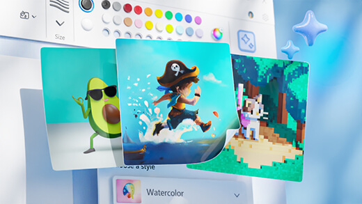
Generate art with Paint Cocreator
Create amazing artwork with just a few words. Microsoft Paint Cocreator will help you unleash your creativity and make your own artworks with the help of AI.
Achieve more with AI in Windows
Windows is the first PC platform to provide centralized AI assistance. Learn how to achieve and create more with Copilot in Windows.
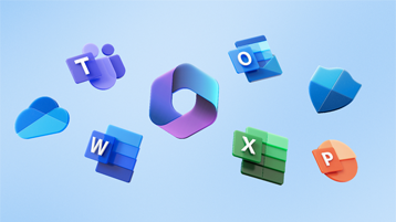
Office is now Microsoft 365
The home for your favorite tools and content. Now with new ways to help you find, create, and share your content, all in one place.

Microsoft 365 Training Center
Get productive quickly with these Microsoft 365 videos, tutorials, and resources.
Microsoft 365 small business success stories

If you're a small business owner
Find the information you need to build, run, and grow your small business with Microsoft 365.
More support options
Contact Support
Enterprise support
Privacy & Security
More support
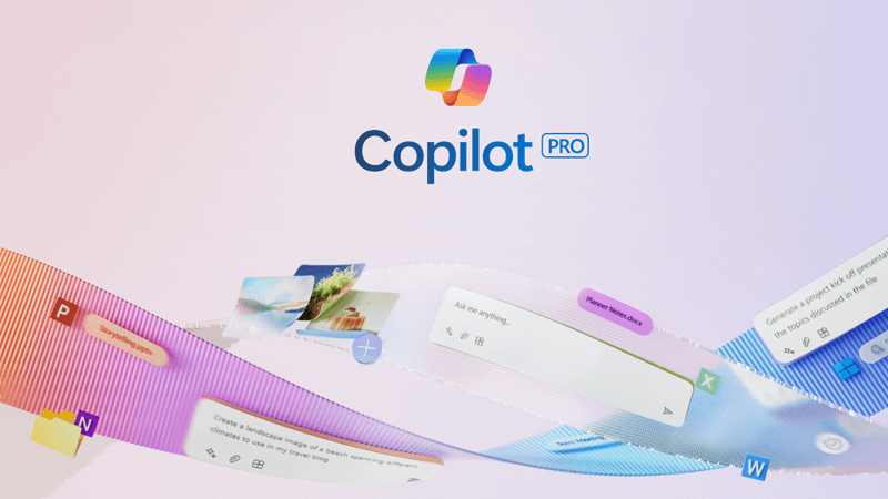
Get more with Copilot Pro
Supercharge your creativity and productivity with a premium Copilot experience. Download the Copilot app for a 1-month free trial of Copilot Pro.